Clients & Ventures
Product/systems design that turns AI tech into business results
I Design and Build AI-Native Product Ecosystems
Introduction
I'm Gil. I work at the intersection of product/systems design and applied AI engineering. I help teams turn complex workflows into useful products and multi-agent systems.
Trusted By
Project Spotlights
Selected Work
AI-native systems, enterprise platforms, and developer tools.
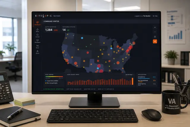
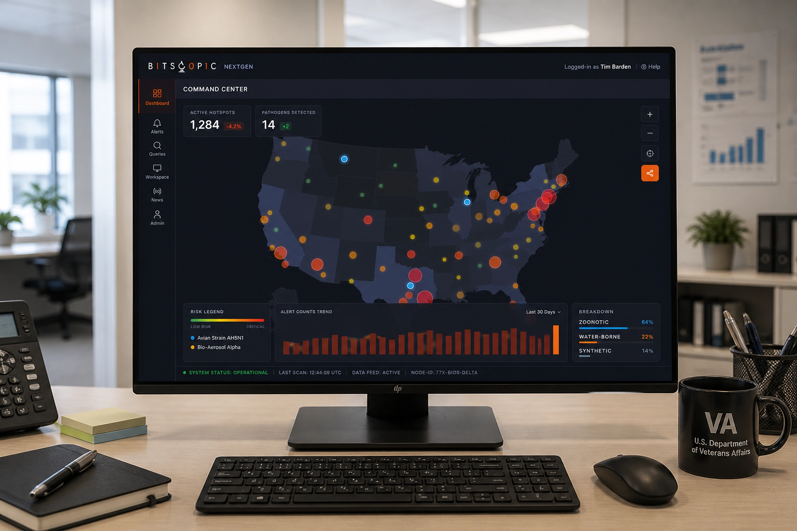
NextGen Biosurveillance
Monitoring nationwide health signals to detect, filter, and investigate emerging disease patterns.
Health
In-App Conversational Interface
A visitor-facing messaging widget that connected live support, announcements, product help, and feedback collection.
Marketing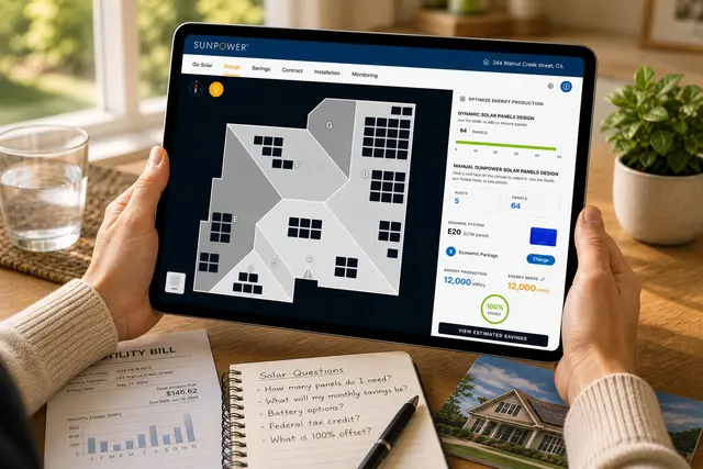
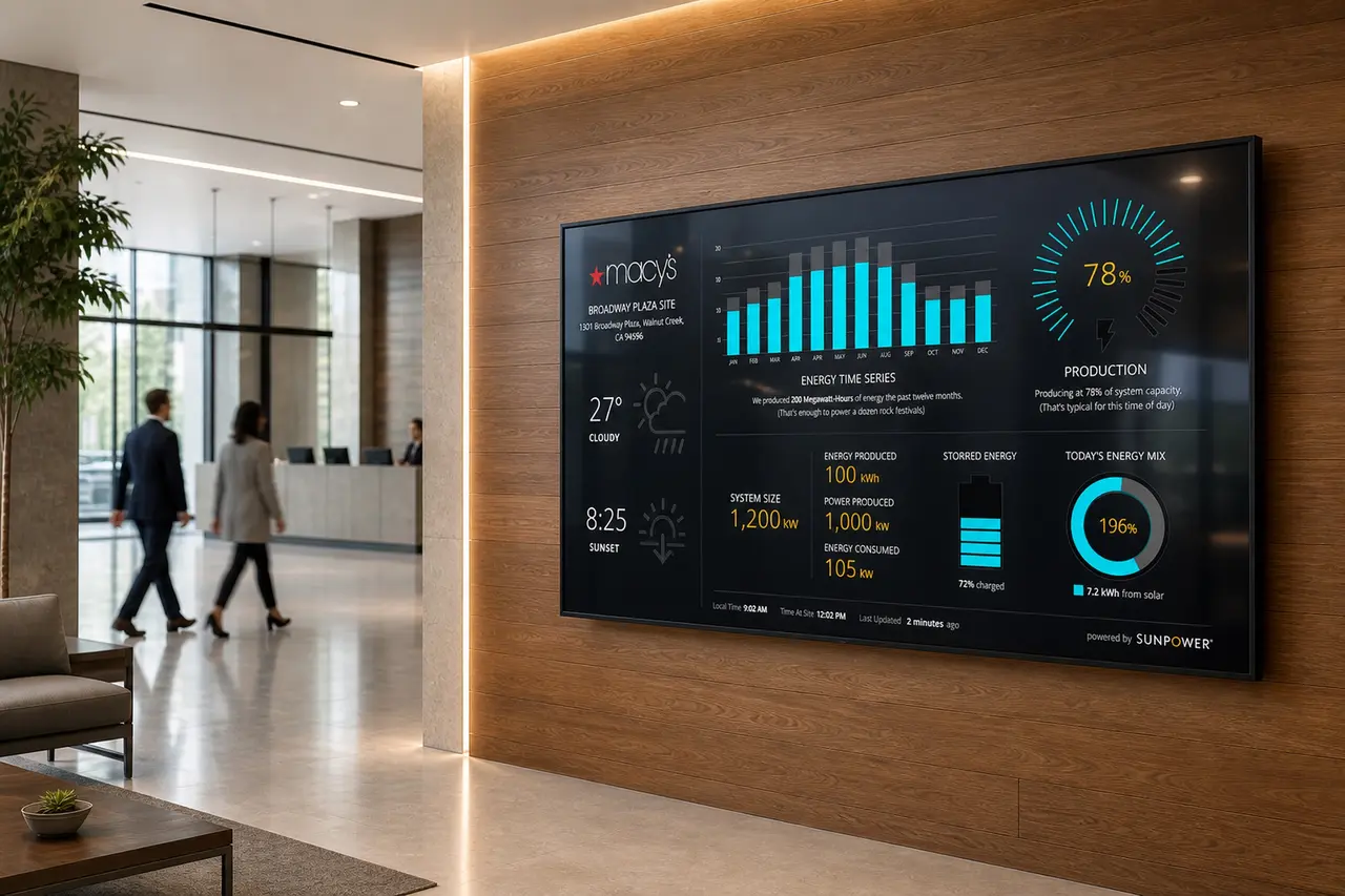
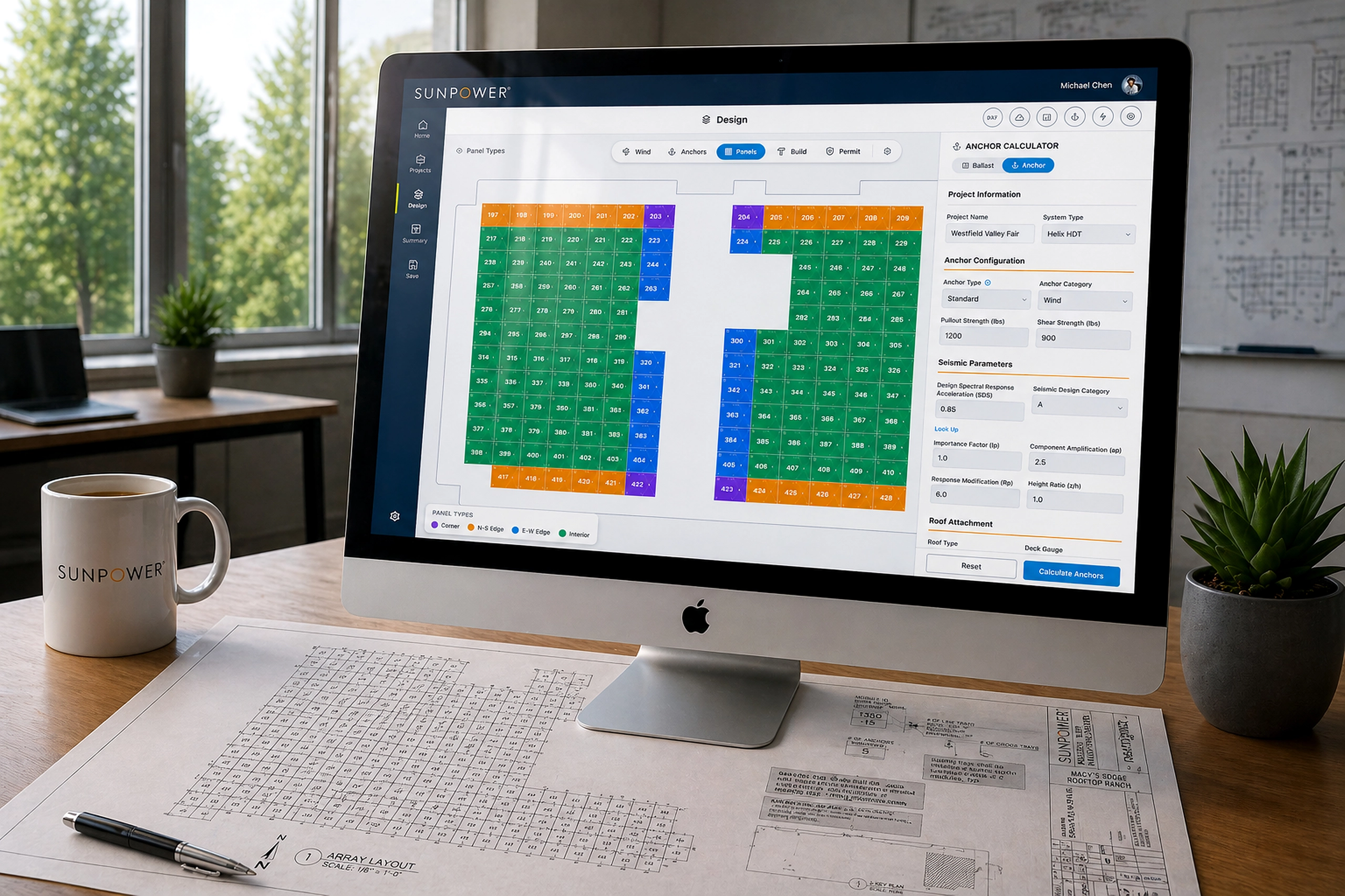
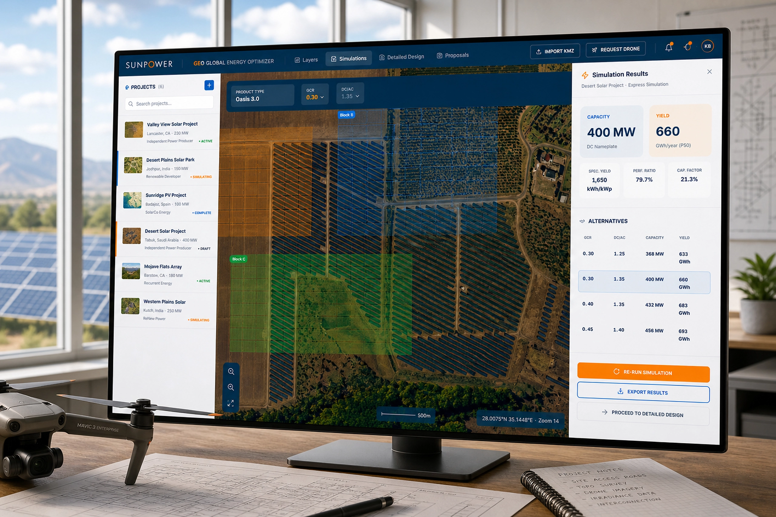
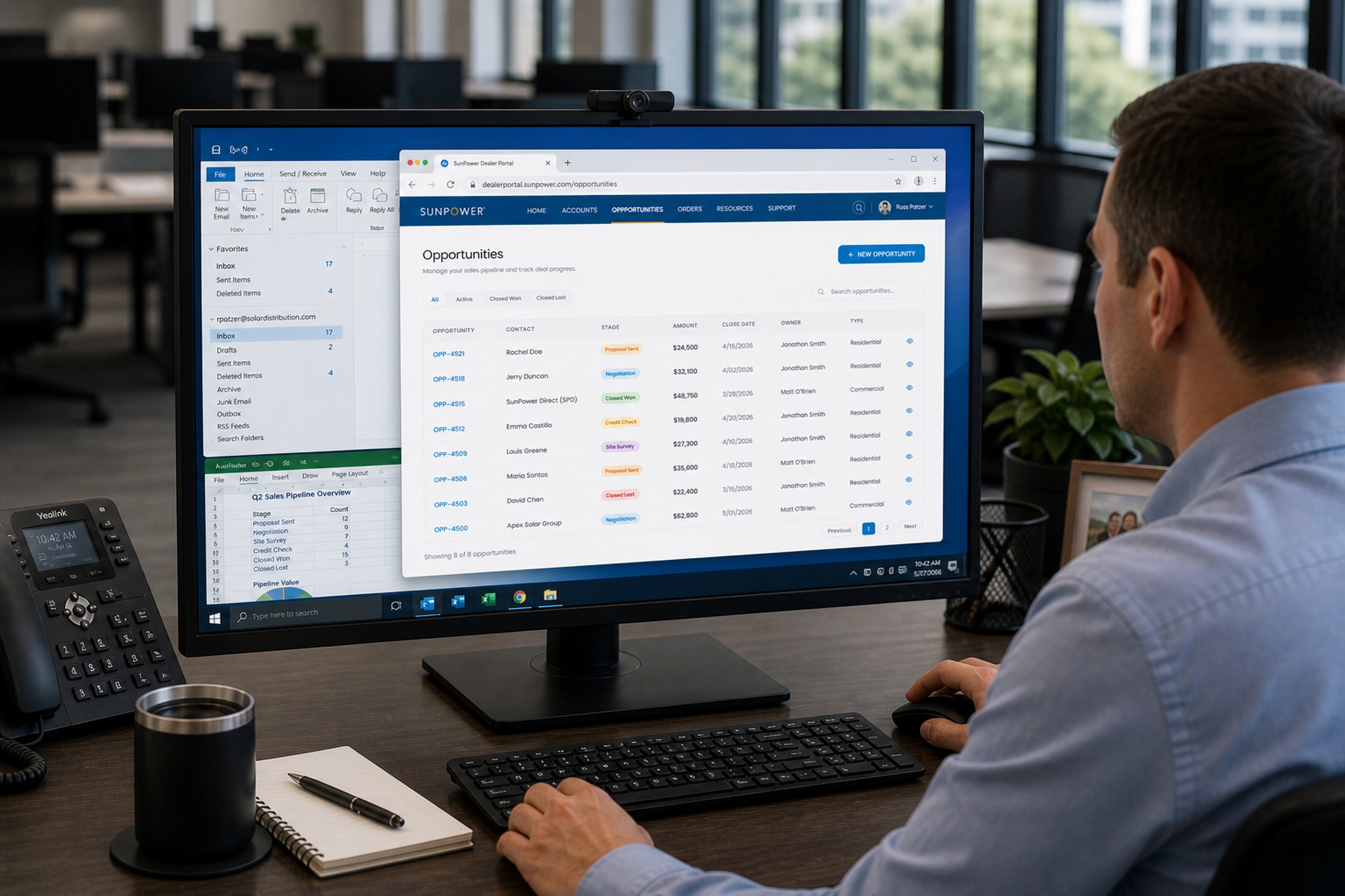
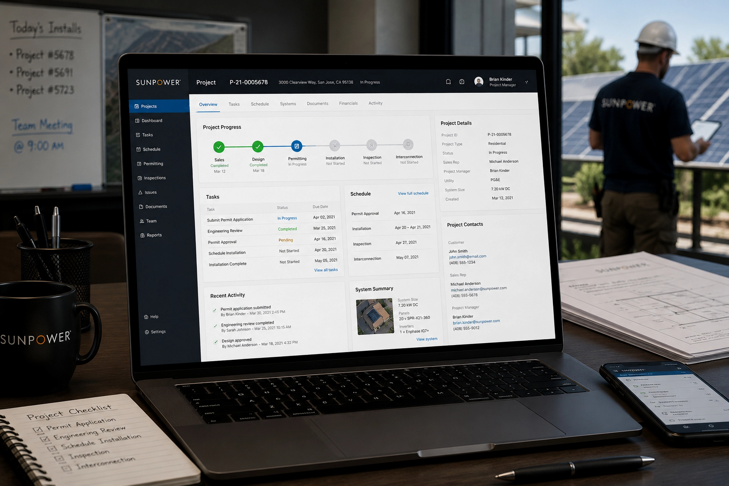
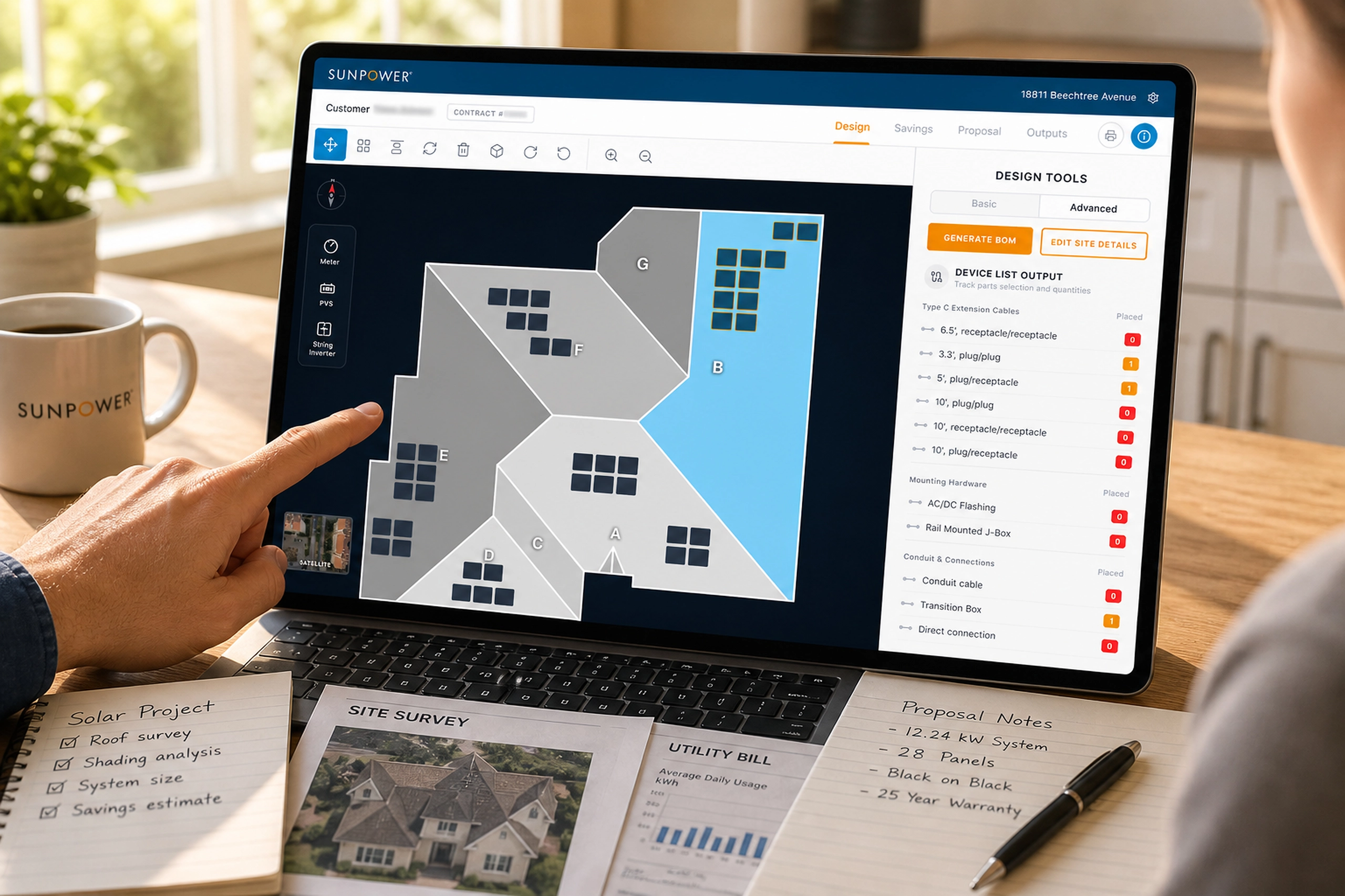
EDDiE - Solar Design Tool
A homeowner-facing solar app that helped customers learn, design, compare savings, sign, track installation, and monitor performance.
Energy & Climate
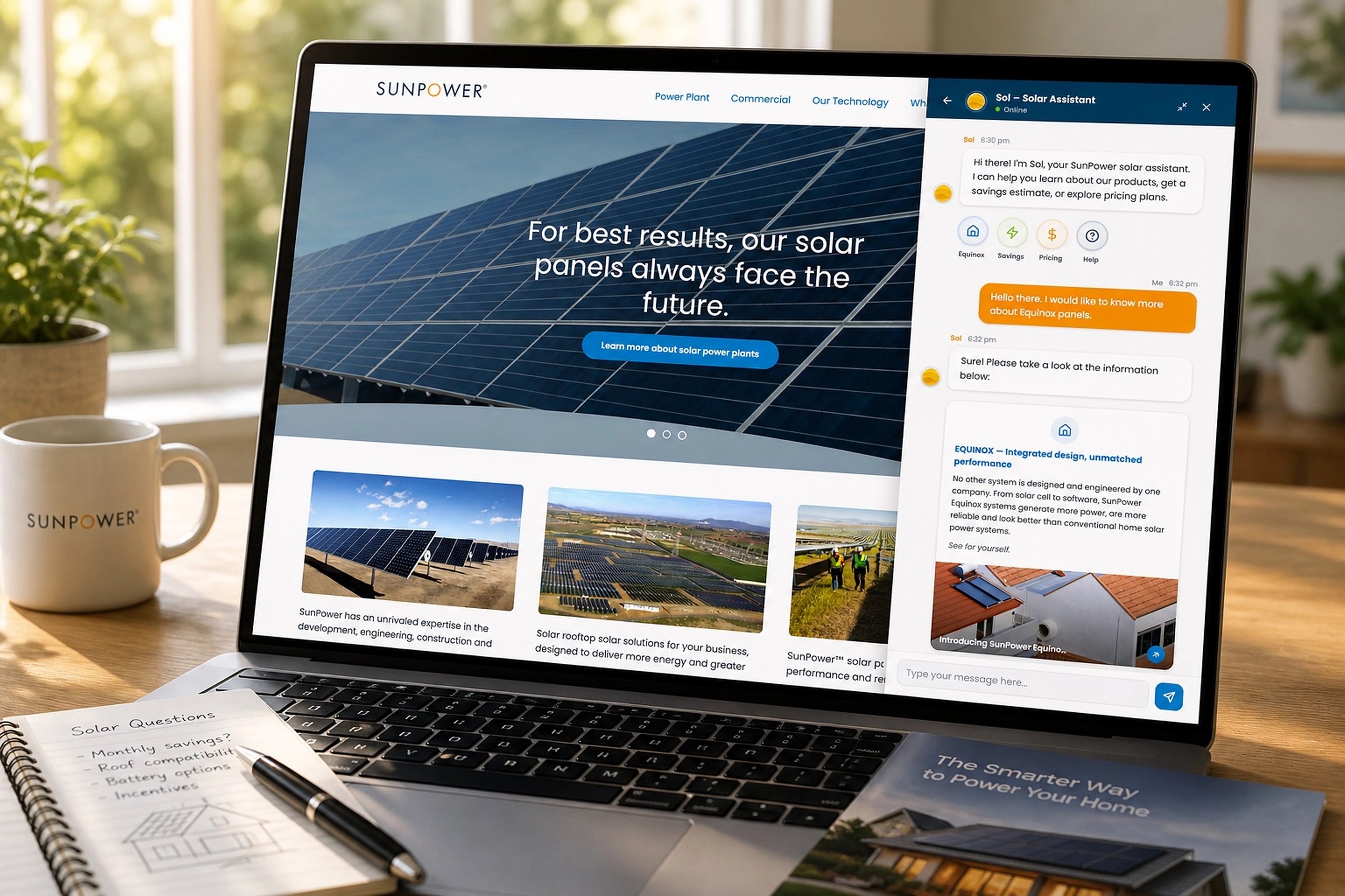
SOL - Homeowners AI Chatbot
An early chatbot experience that helped homeowners learn about solar, ask questions, and move toward savings estimates.
Energy & Climate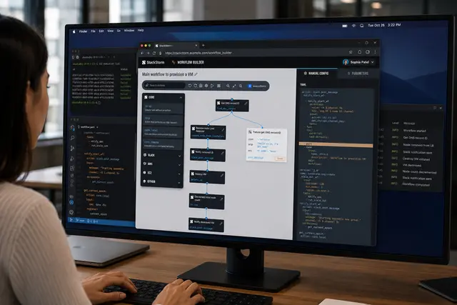
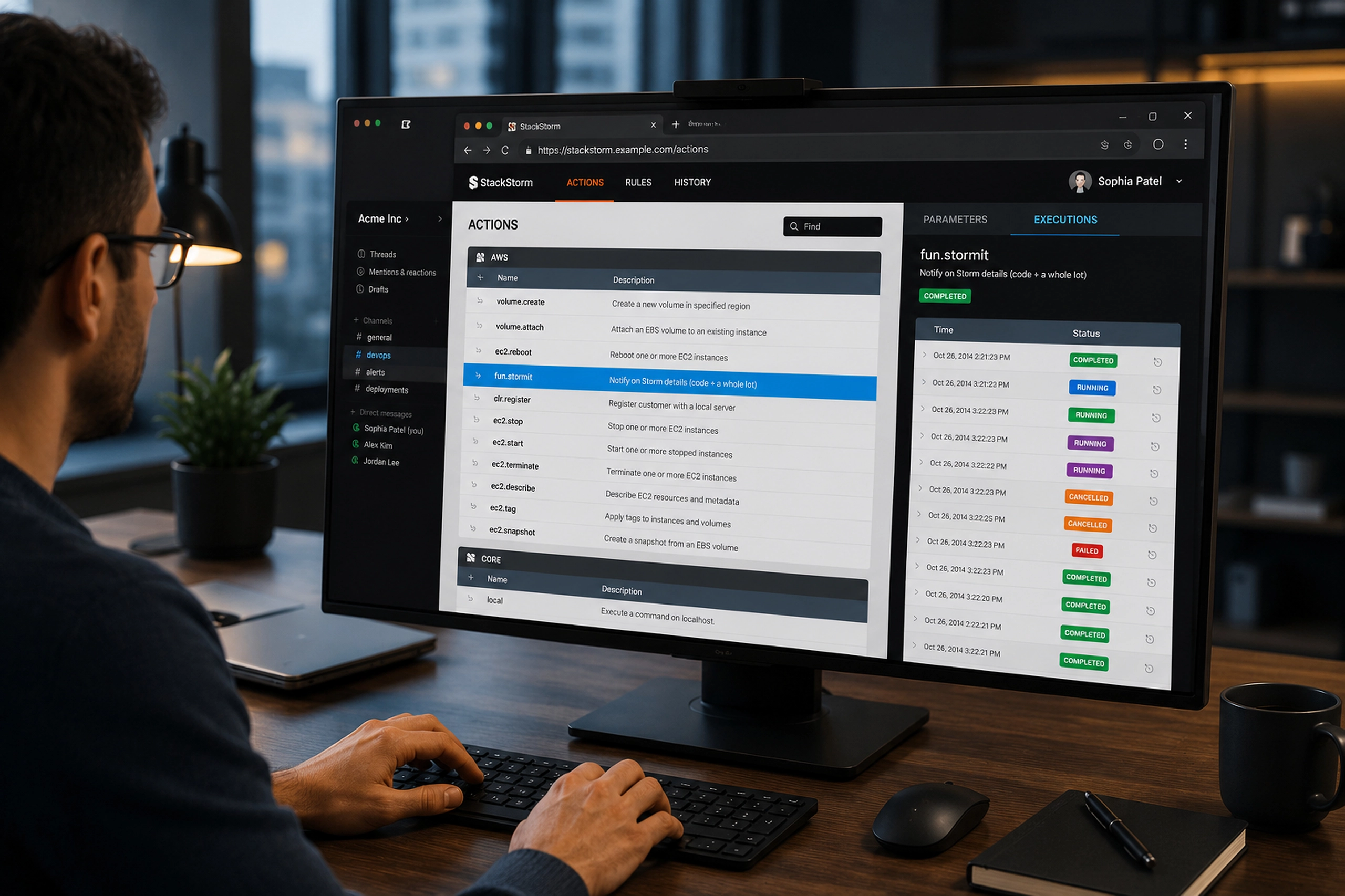
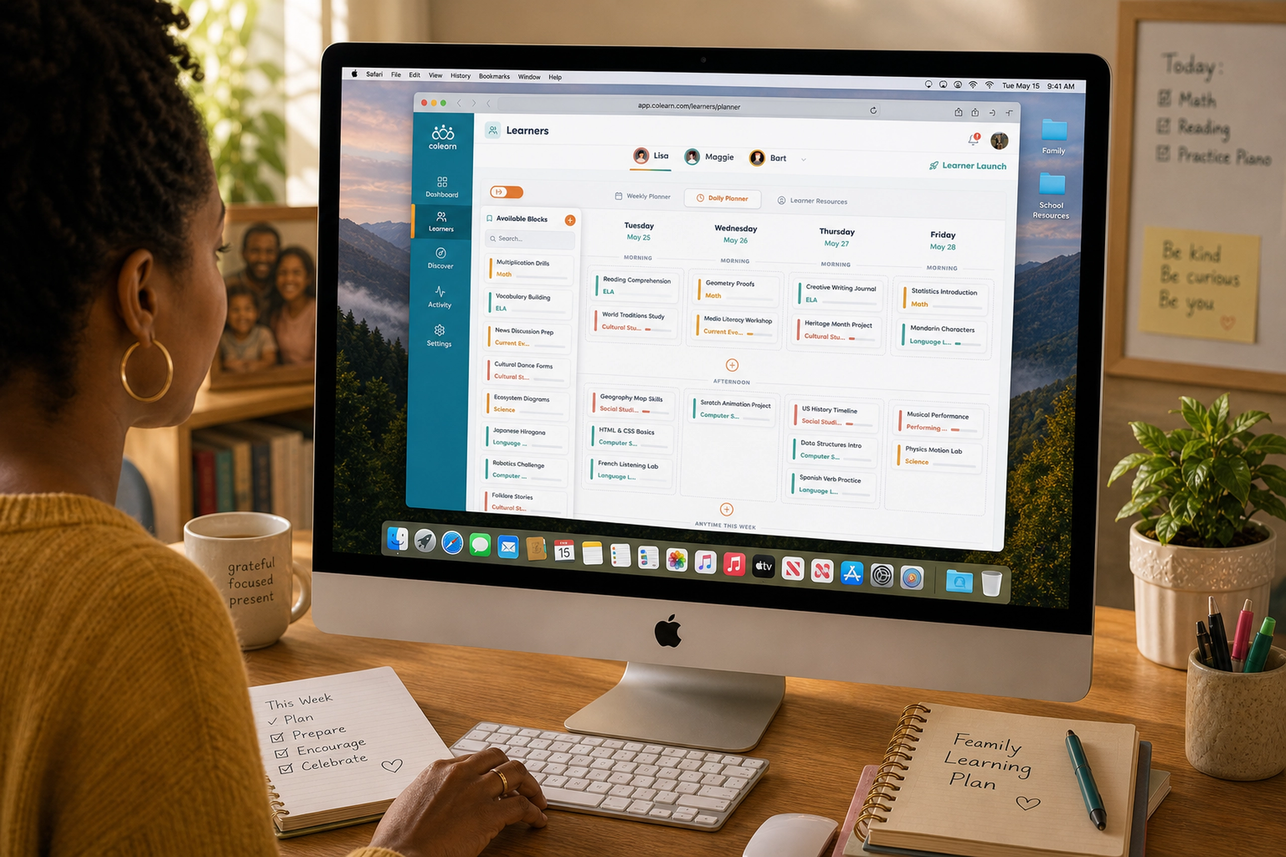
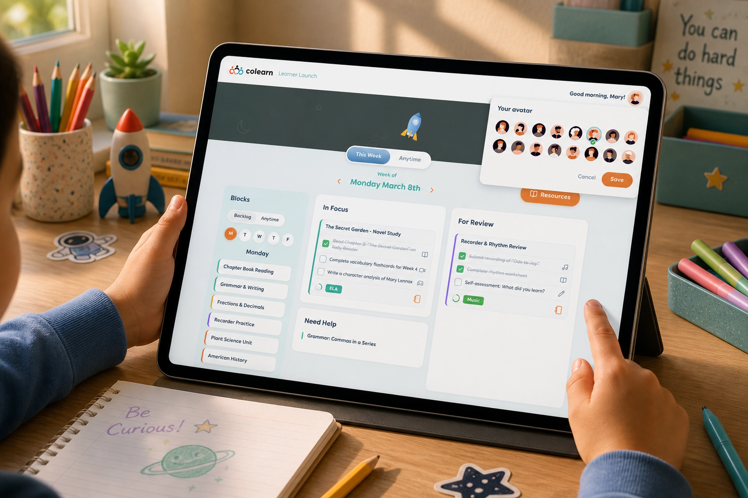
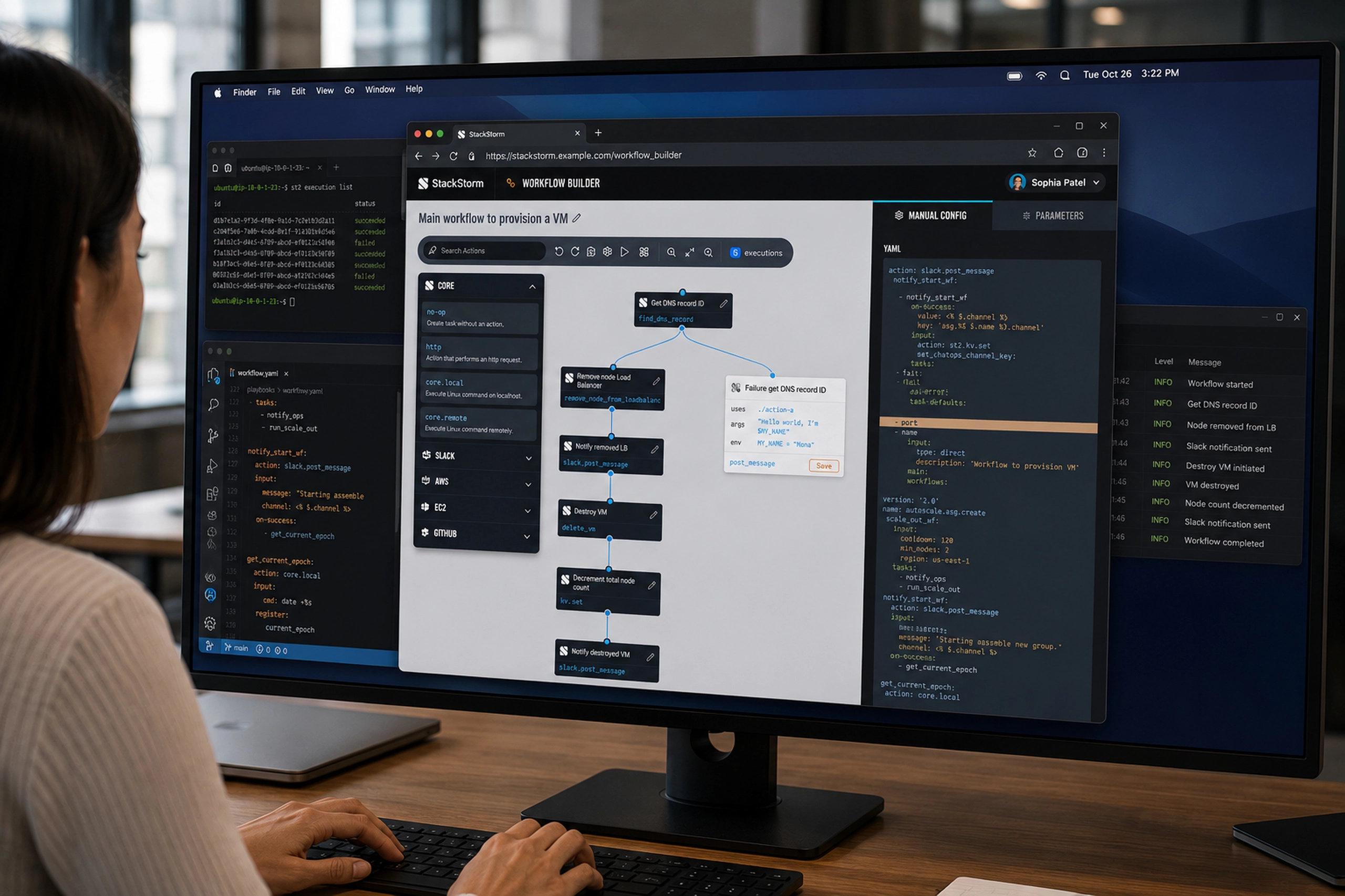
Workflow Builder
A visual workflow builder that helped DevOps teams compose, inspect, and trust complex automation sequences.
Infra & DevOps
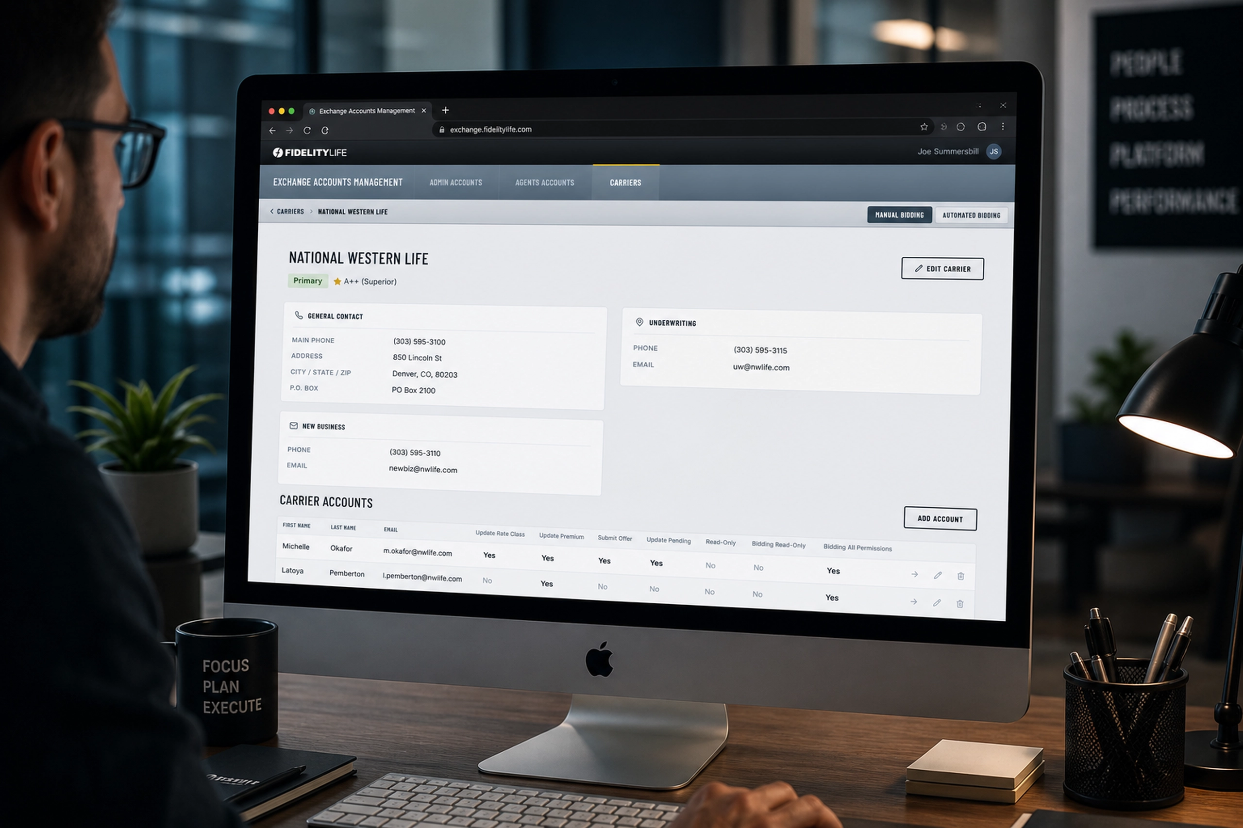
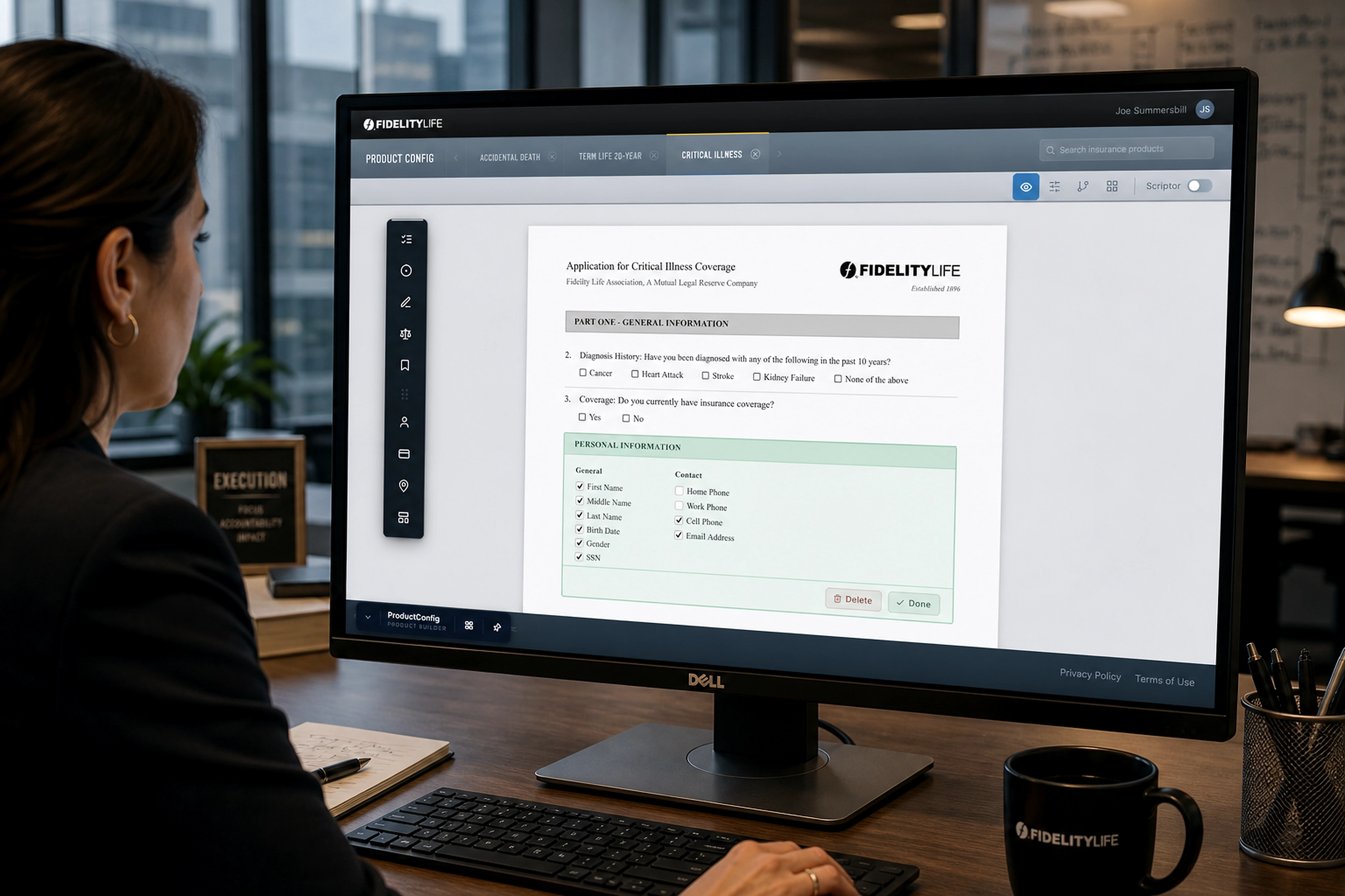
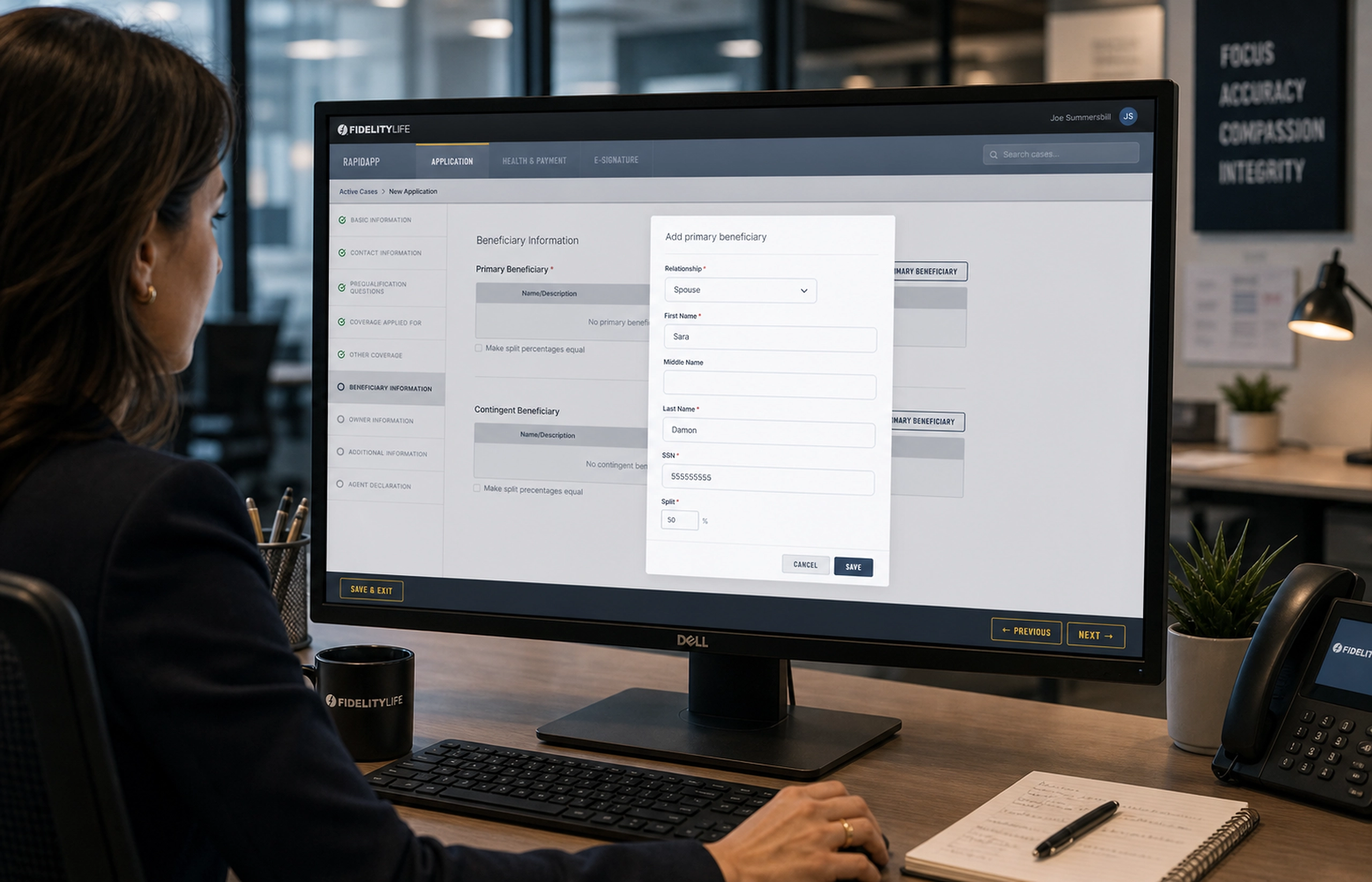
Consumer-Direct - Life Insurance
A direct-to-consumer life insurance experience that helped customers quote, qualify, sign, and submit online.
FinTech
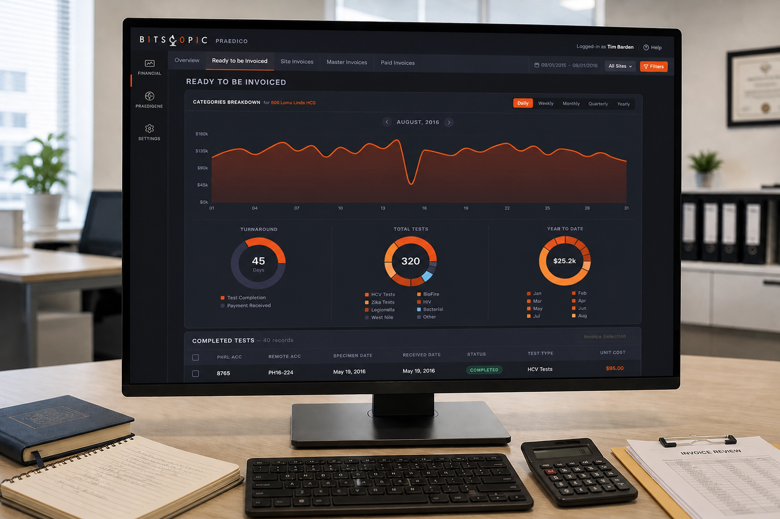
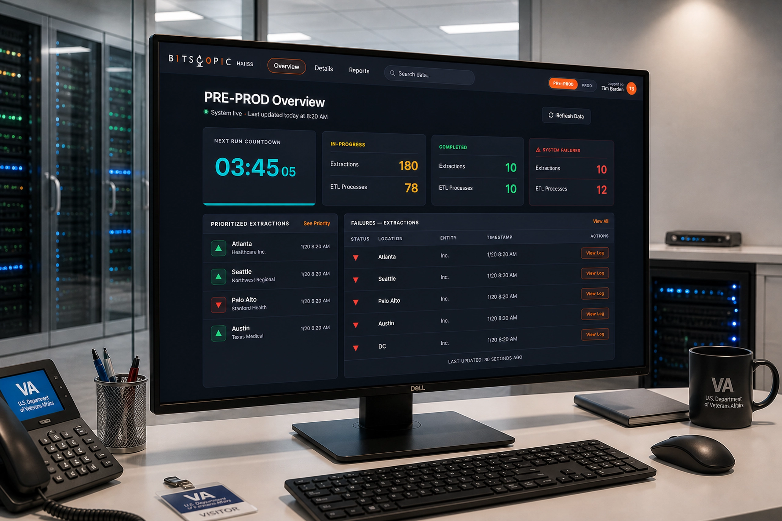
Praedico
Tracking completed lab tests from invoice readiness to payment reconciliation.
HealthPersonal Ventures
Personal Ventures
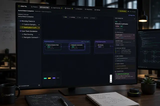
Craftal
An AI-native workspace for generating, inspecting, and validating complex product workflows.
Infra & DevOps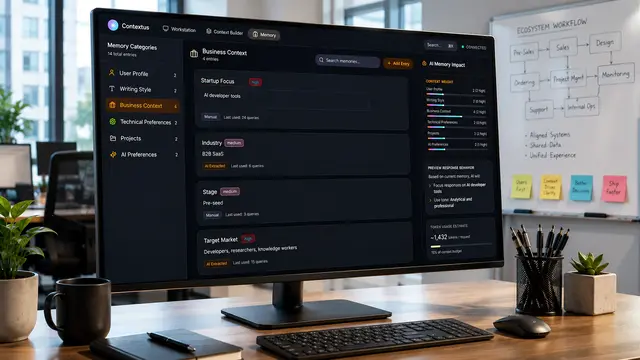
Contextus
A context-native workspace that turns scattered AI interactions into persistent, inspectable knowledge systems.
Health
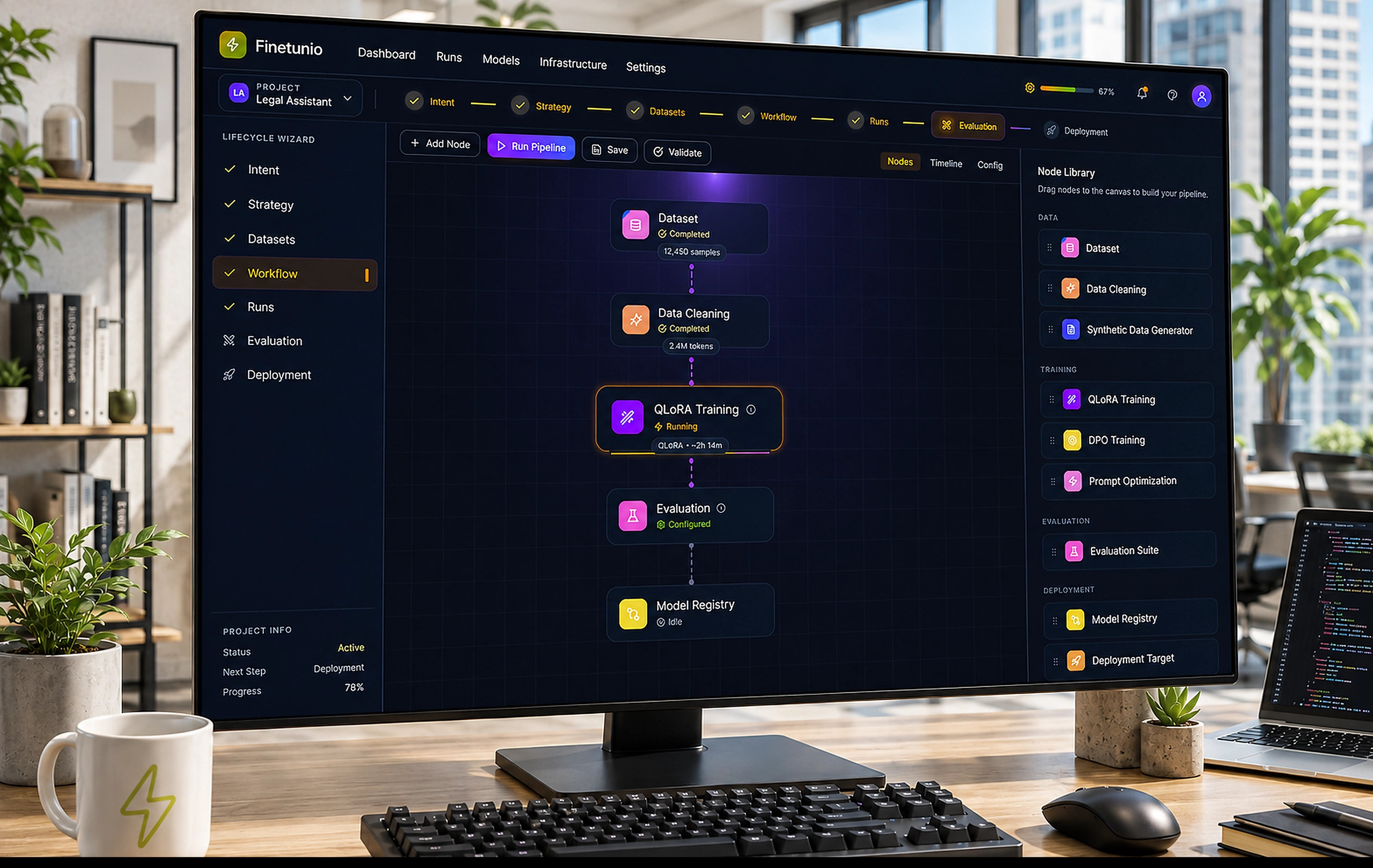
Finetunio - Model Optimization
An intent-first workbench for planning, executing, evaluating, and deploying model improvements.
Infra & DevOpsWhat I Build
From AI capabilities to usable products
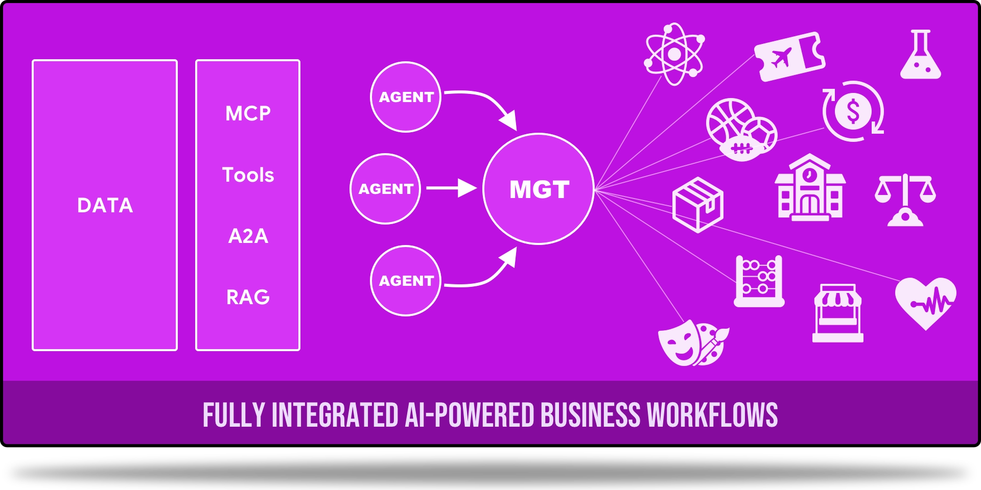
I design and prototype AI-native systems for complex workflows: RAG pipelines, agentic interfaces, human-in-the-loop workflows, structured outputs, and context-aware product experiences.
I work where the interface, the workflow, and the AI logic have to fit together.
Where design meets implementation
I design for expert users, developer-adjacent tools, internal platforms, dashboards, workflow builders, and API-connected systems.
I bring implementation fluency (prototyping in React, Vue, Python/FastAPI) so design decisions are grounded in technical reality, not just visual preference.
From messy workflows to AI-ready systems
I help organizations turn complex operations, business logic, and AI capabilities into coherent systems.
My Product Systems Transformation Process starts with how work actually happens and builds from real workflow modeling to measured, governed automation.
Who I Work With
AI Companies & Developer Platforms
Teams building developer tools, AI infrastructure, and technical products where the UX/DX problem is as hard as the engineering problem and needs the same rigor.
Startups & Founders
Early-stage teams that need to move from vague AI capability to a working product, demo, or implementation-ready system, without agency bloat or fuzzy specs.
Enterprise Organizations
Companies with complex workflows that need a practical, measured path to AI adoption, not a generic transformation pitch.
Testimonials
Gilberto is one of the best UI/UX professionals I have encountered, and I do not say that lightly. He built our digital design practice from nothing and in the process helped to win both internal and user trust. Our product managers enjoy working with him across all types of projects, from sales software to operational interfaces.
There is not a part of our platform that has not benefited from his work. I recommend working with him and looking forward to doing so again.
Gilberto is the best product designer I've worked with throughout my many years developing software. His experience spans beyond just UI/UX and additionally goes into frontend development, allowing him to effectively communicate with and work alongside deeply technical engineers.
When it comes to product design concepts, he has an incredibly deep understanding of how to structure various distinct modes of user interactions and semantically different activities.

Project Gallery


Case Study
[Case study modal placeholder]
About Me
Introduction
I'm Gil, an AI Product Design Engineer. I take complex workflows and turn them into AI-native systems, from discovery through shipped product.
Design Philosophy
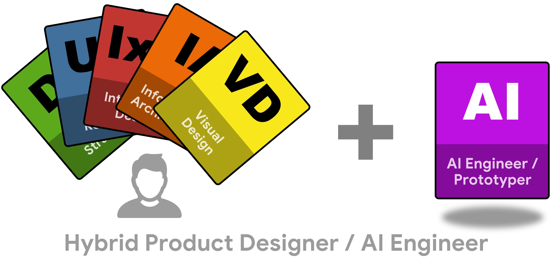
My north star is the complete practitioner: the idea that the best AI-native products are shaped by one mind that can hold design, engineering, and AI logic simultaneously, not handed off through layers of interpretation.
When the same person who defines the workflow also builds the prototype and wires the AI, translation loss disappears. Teams move faster and the gap between what we designed and what shipped closes.
Days to ~20 minutes
Compressed a high-friction insurance workflow into a faster, clearer operating path for teams and customers.
16+ internal tools
Carried a multi-year product ecosystem across sales, design, installation, and monitoring workflows.
5,000+ developers
Helped technical audiences adopt new platforms through demos, workshops, and practical product education.
What I Bring
Enterprise End-to-End Systems Builder
I've designed complex product ecosystems at enterprise scale — multi-product platforms, multi-role workflows, and long-running transformation initiatives as a solo designer. Systems thinking, not just screen design.
- SunPower — 16+ tools, 12+ PMs, 3-year initiative
- Fidelity Life — workflow compression: days to ~20 min
- Two 3+ year digital transformation programs
- StackStorm, Bitscopic, Western Union, Blue Coat
AI-Native Product Design Engineer
I design and prototype AI-native product systems — RAG pipelines, agentic workflows, human-in-the-loop interfaces, structured outputs, and context-aware products. AI product work grounded in real systems, not demos.
- Craftal — AI product planning system (RAG, DSL, agents)
- CareDash — multi-agent healthcare workflow
- Contextus OS — context-native AI workspace
- IBM Watson chatbot at SunPower (pre-LLM wave)
- AI Engineering Bootcamp · Harvard AI Intensive
Technical Educator & Evangelist
I help people understand, adopt, and build with new technologies — through demos, workshops, tutorials, and product systems thinking. Teaching as adoption; adoption as product design.
- Microsoft tech evangelist — 5,000+ developers
- General Assembly — UX instruction & mentorship
- Narwhale Pod — AI education for builders
- MAS Workflow Design Playbook (original methodology)
- AI workshops · Technical tutorials · Executive education
How I Work
I don’t start with AI. I start with how work actually happens.
The method works in cycles. Each one scoped small enough to prove value fast, wide enough to compound across the whole system.
Each cycle makes the next one faster, safer, and more valuable. Real workflows before AI use cases. No baseline, no proof. No proof, no scale.
Understand
- Discover
- Model
- Baseline
Know before you build
Intervene
- Design
- Adapt & Script
- Measure
Build small, prove value
Promote
- Promote
- Orchestrate
Make it durable and connected
Scale
- Govern
- Reuse & Expand
Govern and compound
Where most AI projects break down
Most AI failures aren't technical. They're structural: siloed teams, AI built without real workflows, ideas that can't survive contact with production. The method closes those gaps.
Design, engineering, and AI in separate rooms
Work lands in three different hands. Every handoff is a translation, and translation is where ideas lose fidelity.
One practitioner across all three layers
I lead design, write code, and wire the AI as one strategic partner across all three disciplines. No handoffs, no interpretation layers, no gap between what was designed and what shipped.
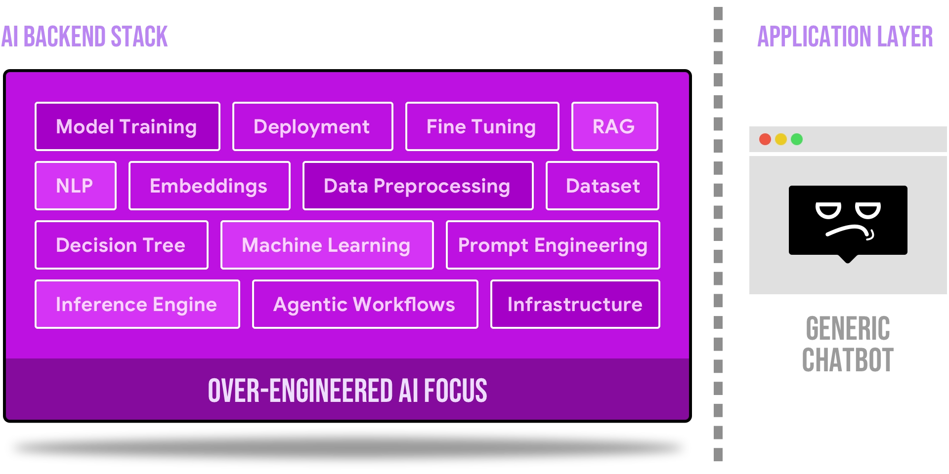
AI built without a workflow to plug into
Teams rush to launch LLM features with minimal ROI. Without mapping real workflows or solving real problems, the result is unused chatbots and shallow automation.
Bridge between LLMs and real work
I map how work actually happens first, then wire the AI stack into those real decisions. The result is automation that runs, not a chatbot no one uses.
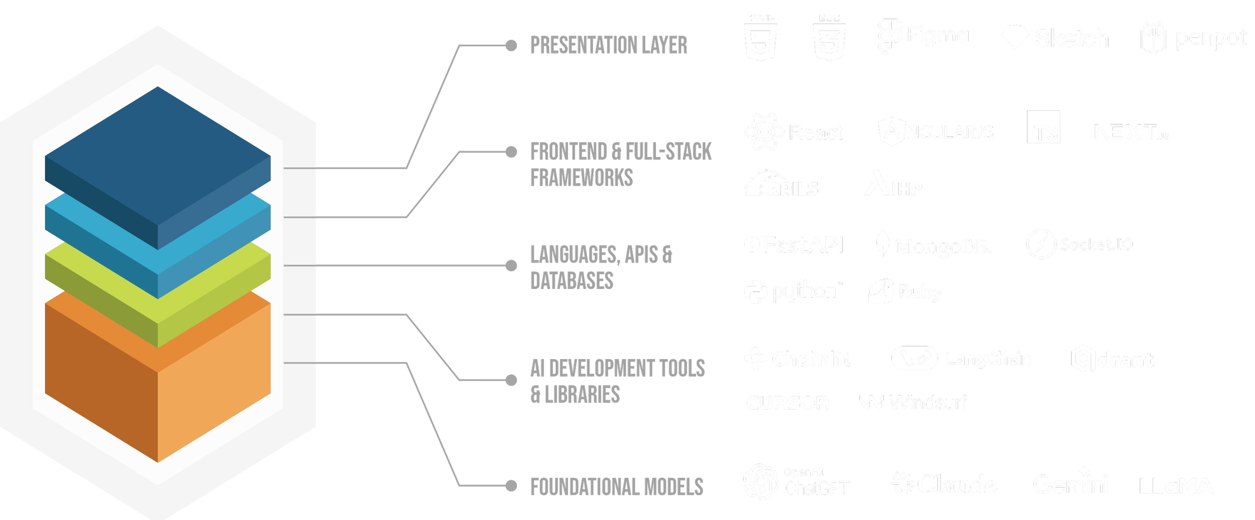
Technical Toolkit
The full stack, from workflow model to deployed AI system.
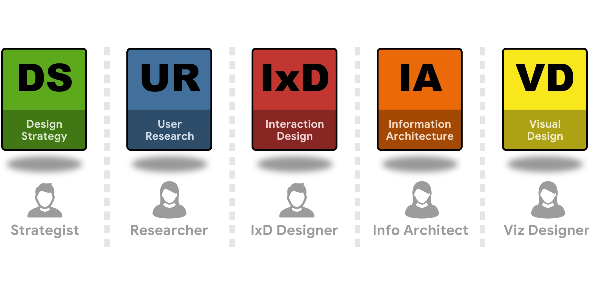
My stack spans the full system: AI engineering (OpenAI & Anthropic APIs, LangChain, LangGraph, DSPy, RAG pipelines, vector stores, structured outputs, agent orchestration), frontend and prototyping (React, Angular, Vue, TypeScript, API-connected interfaces), backend and tooling (Python, FastAPI, Rails, PostgreSQL/pgvector, Docker), and product and design (systems modeling, workflow mapping, information architecture, interaction design, design engineering).
As a product generalist, I choose the right tool for each layer (design, front end, data, or model) so ideas travel from workflow model to shipped system without unnecessary handoffs.

Getting personal
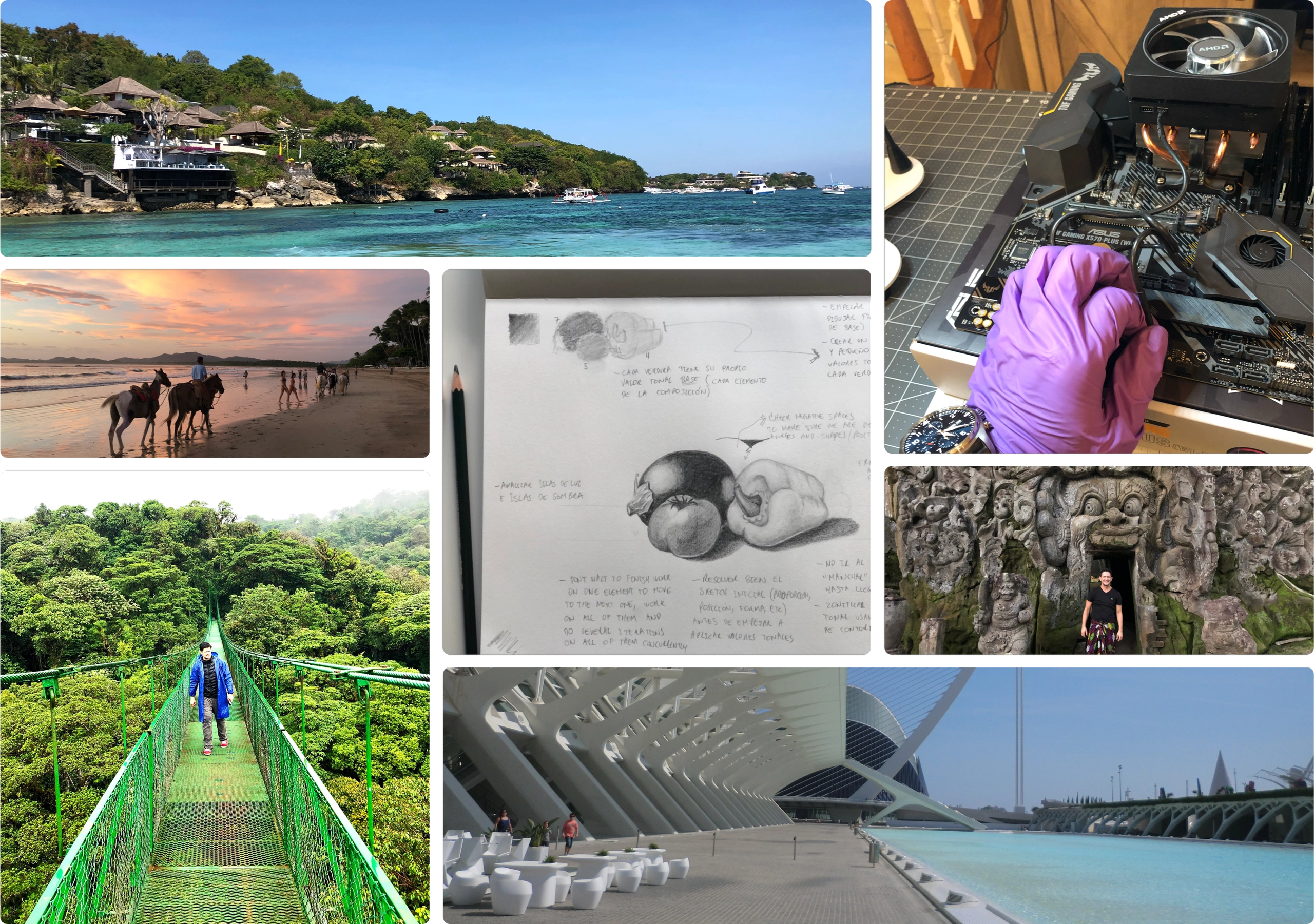
Things I do when I'm not building
Still-life sketching, coastal hiking, PC teardowns, and slow travel through cities with good architecture.
I draw to stay sharp. I travel to stay curious. I take things apart to stay honest about how they work.
The Narwhale Pod
Welcome to the Narwhale Pod! In the tech world, designers who code are often called "unicorns": mythical creatures of legend. But I believe these skills are very real and increasingly essential. The ability to bridge design and development creates more cohesive and innovative digital experiences.
Narwhals, the unicorns of the sea, are a perfect metaphor: they're real, they're remarkable, and they navigate their world with unique capabilities. This space is dedicated to exploring the intersection of design, code, and AI, sharing insights, projects, and practical magic.
Featured Articles

Designing the App Layer for Agents
A post-mortem from the Berkeley Agentic AI MOOC, written for hybrid designer-developers working in the application layer. It reframes agents as long-running, distributed systems rather than chat UIs, and shows how evaluation design, test-time strategies, memory, and visible state and recovery flows are the real product-design problems behind agentic products.
Read on MediumWhy Governance Is the Missing Layer in AI Product Design

A post-mortem from the Harvard Data Science Initiative Agentic AI Intensive. It argues governance is not a compliance afterthought but a core design layer: as agentic systems break the deterministic software model, designers must own accountability, guardrails, and human-in-the-loop validation.
Read on MediumRevolutionizing Medical Intake with AI Agents
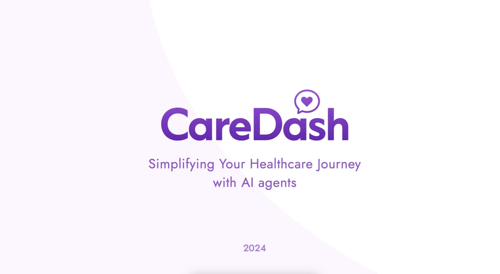
Explores CareDash, an AI-driven chatbot built at a Berkeley hackathon to simplify medical intake for clinics and patients. It uses a RAG pipeline over questionnaires and policy documents, with patient-friendly touches like medical-term lookup and secure e-signatures.
Read on MediumUnlock the Power of AI — No Internet Required
Introduces the benefits of an offline AI assistant: remote work with no internet, productivity on long flights, or keeping sensitive data private. It sets up a hands-on series on building your own local, RAG-powered assistant that runs entirely on your laptop.
Read on MediumComing Articles
Drafts in the pipeline, distilled from my current build notes and design narratives across Craftal and Contextus OS.
- CWM → CIR: two artifacts, “what” vs “how”
- Design-first: earn the DSL against real domains
- Two natures: domain “meat” vs instrumentation “wiring”
- Dual-runtime: human/CWM vs machine/CIR
- How we know the notation is right: convergent evidence
- The Neufert vision: a shared repository of business domains
- Why user flows weren’t enough: adding the system substrate
- Blueprint vs Specification: a human source that compiles to a machine-ready artifact
- What we added to ATOS, in plain terms
- Auditing AI builders: read the repo, not the report
- The boundary held: what design-first bought us
- Carrying a project across AI threads: a context-continuity system
- Earn the shape before you build it
- Every AI-builder handoff should be a committed file
- Decide, distill, explain: three genres for project knowledge
- Rationale docs: a thinking workspace before the ticket
- Let each slice tell you where the next risk is
- A stage is green, or it’s stopped: nothing in between
- The classifier seam: two provider modes, one pure core
- Two layers of undo: portable history vs the personal timeline
- Loop engineering: gates between phases, autonomy within them
- Determinism is the moat: narrow the LLM to judgment
- One artifact, three faces: layering sophistication over one core
- What an inbox pass actually delivers vs. the vision
- Not everything is an atomic note: genres, homes, and schemas
- Is it real, or did we dream it? Telling a valuable system from a green one
Dive deeper into the pod and explore all articles on Medium at The Narwhale Pod.
Contact Us
Contact form or information will go here.
Project Detail

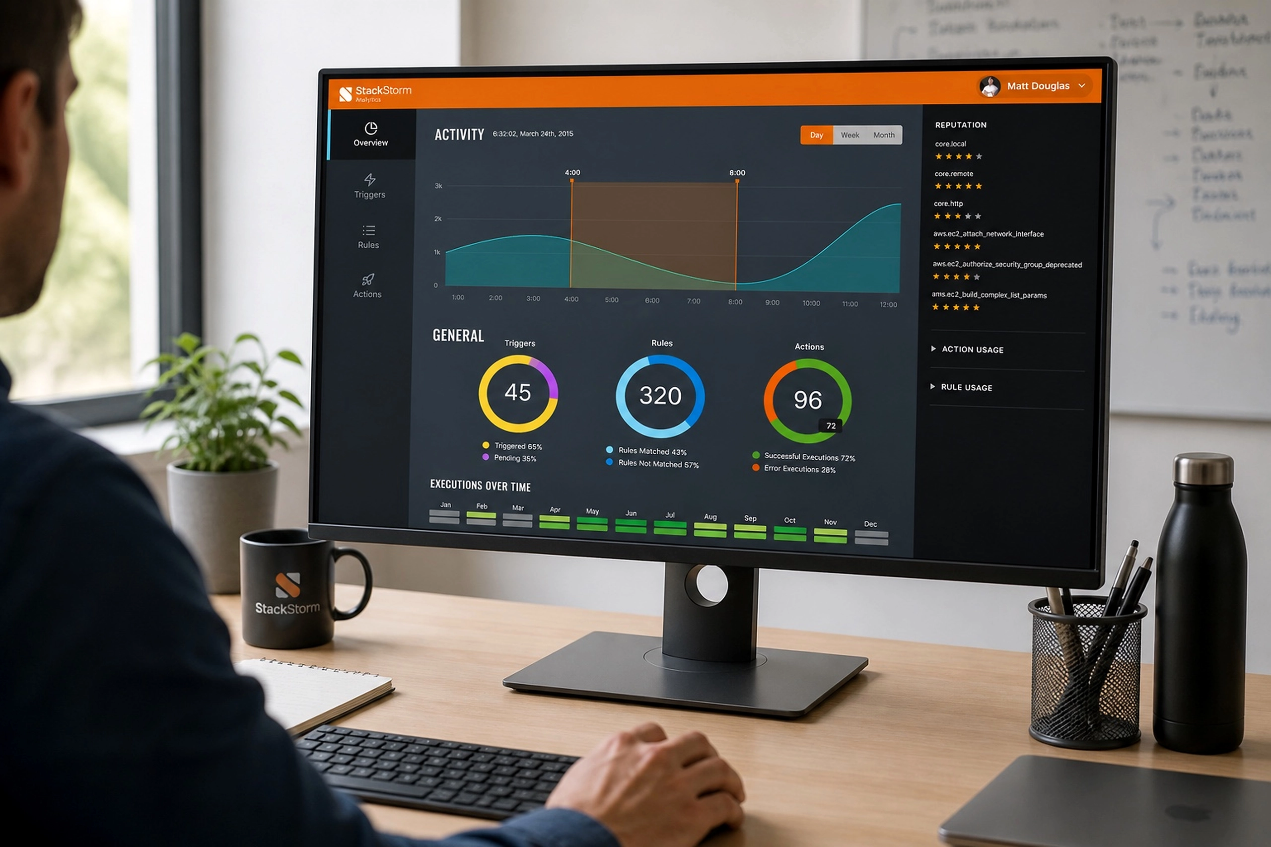
Analytics Dashboard
Summary
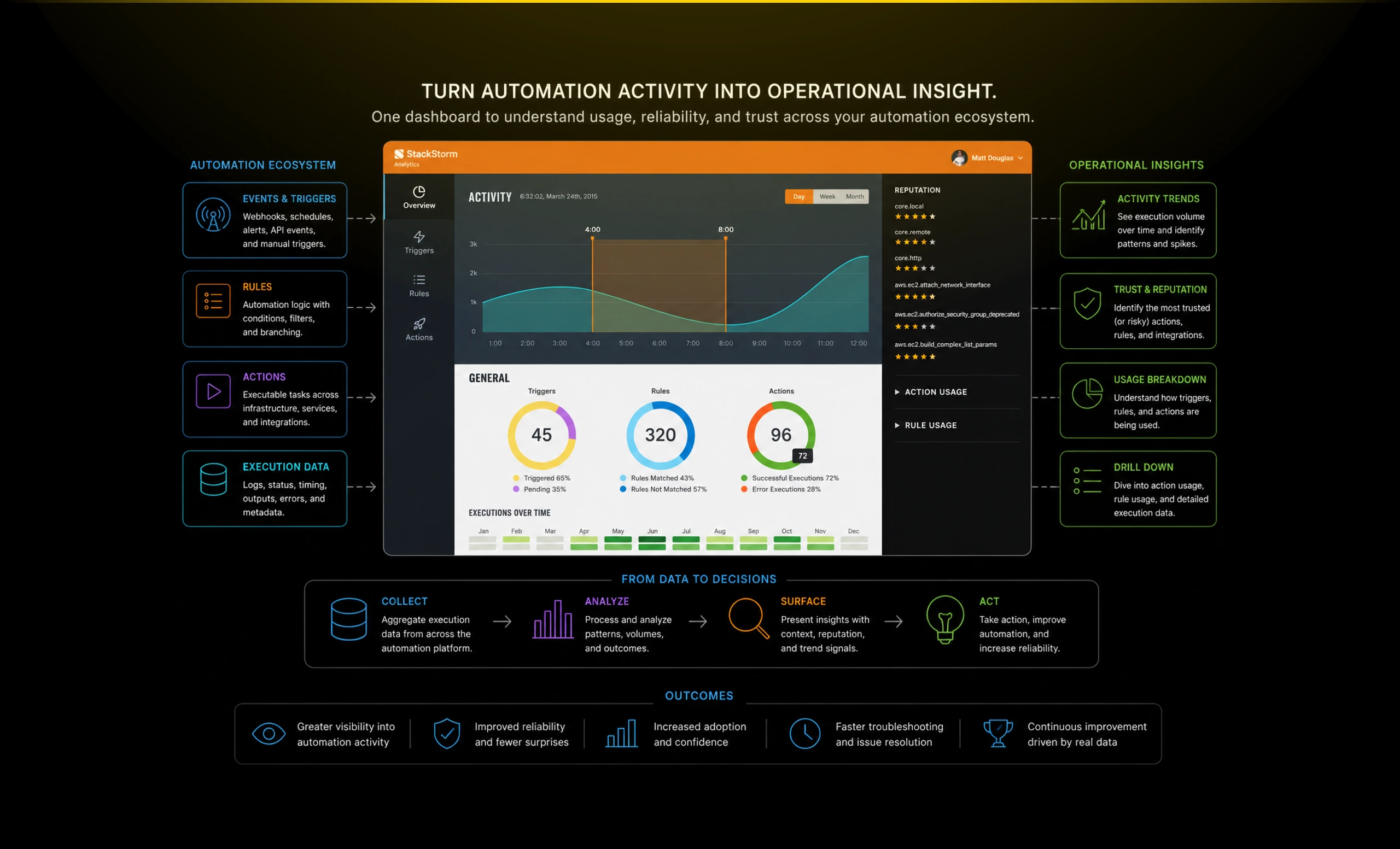
An automation analytics dashboard that helped DevOps teams understand usage, reliability, and operational performance.
StackStorm made automation executable, but teams also needed to understand how that automation behaved over time. Without analytics, it was hard to see which rules, actions, and triggers were trusted, failing, or heavily used.
I designed an analytics experience that translated automation activity into operational insight, helping teams monitor reliability, adoption, and system behavior from a single dashboard.
Outcome
The Analytics app helped StackStorm complete the automation loop.
Actions and workflows were no longer just configured and executed. They could be observed, evaluated, and improved over time.
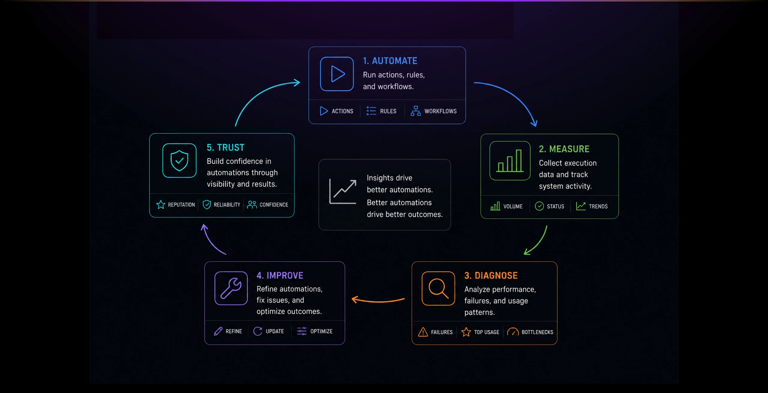
The product gave teams a stronger sense of control over their automation environment. It helped turn invisible background activity into a measurable, inspectable system.
Key outcomes:
- Made automation activity easier to monitor.
- Surfaced usage patterns across triggers, rules, and actions.
- Helped teams identify trusted and problematic automations.
- Supported better troubleshooting and operational confidence.
- Reinforced StackStorm as a full automation control platform, not just an execution engine.
The Problem
Automation platforms can become opaque once teams start using them at scale.
Actions run in the background, rules fire automatically, and failures may only become visible when something breaks.
Teams needed a way to answer practical questions: Which automations are active? Which actions are trusted? Which rules are used most? Where are failures happening? Is automation improving operations or creating hidden risk?
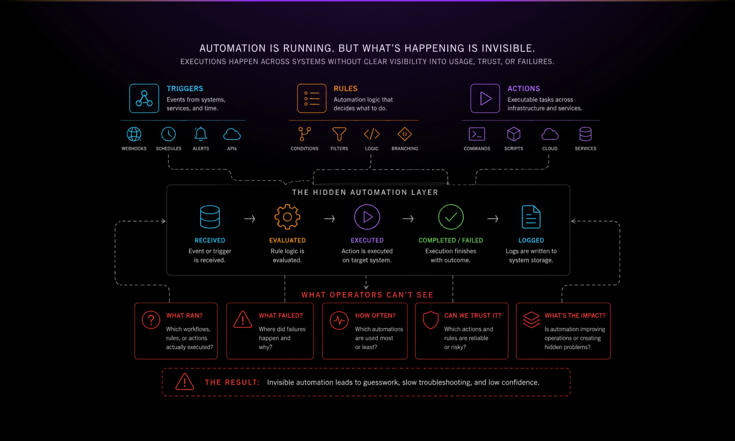
The challenge was to design analytics for operators, not executives. This was not a vanity dashboard. It needed to surface signals that helped technical teams understand reliability, adoption, and operational confidence.
Solution
An Analytics app as a monitoring layer for the automation ecosystem.
The dashboard combined activity trends, execution volume, reputation signals, and usage breakdowns into one operational view.
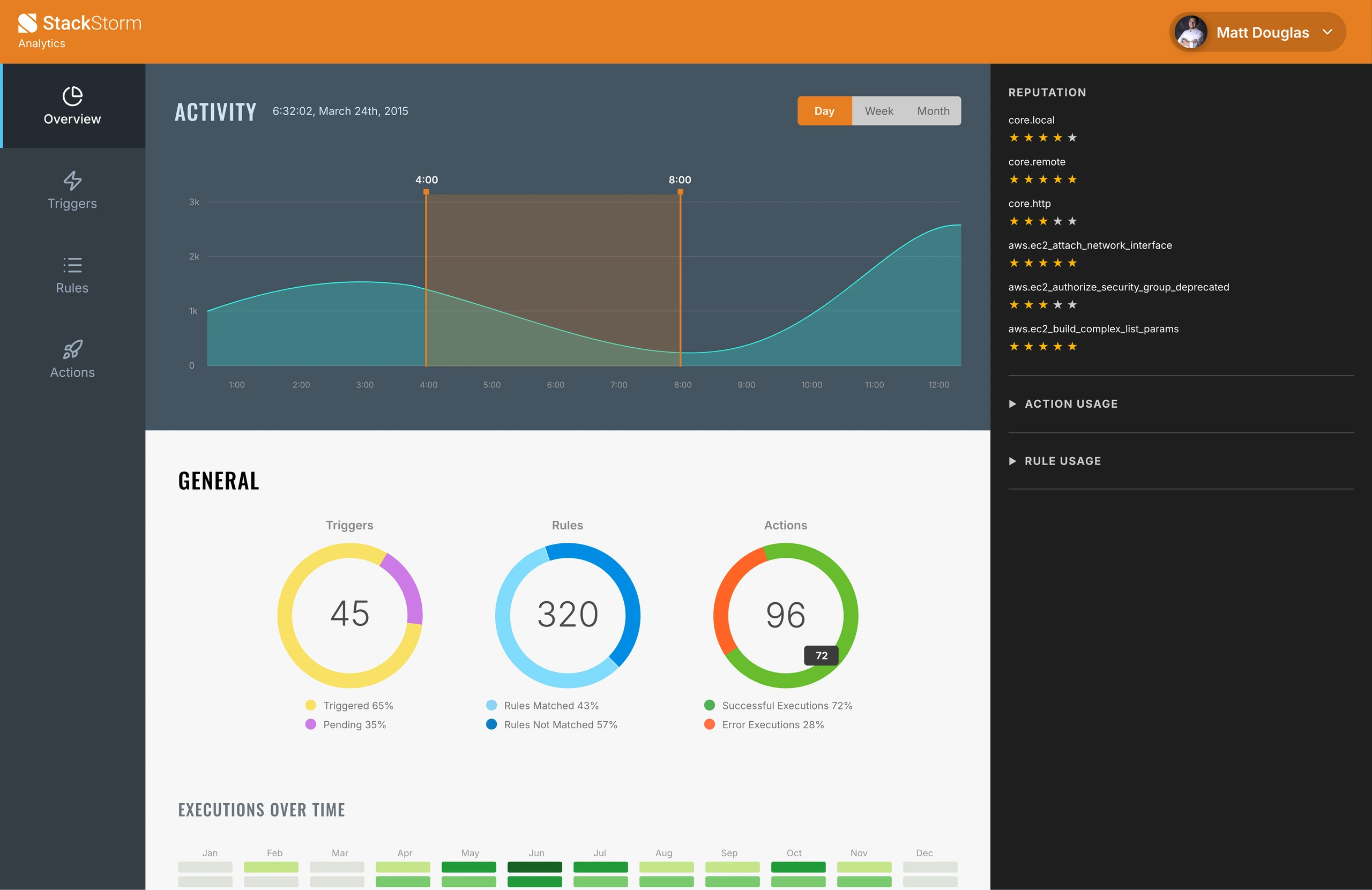
The main activity chart gave users a temporal view of system behavior. The circular summaries made key totals easy to scan: triggers, rules, and actions. The right-side reputation panel introduced a trust signal, showing which automations were performing well and which deserved attention.
The design kept the product visually aligned with StackStorm’s technical identity: dark navigation, dense information, strong contrast, and focused data panels.
The most important design decision was to treat analytics as part of the automation feedback loop. Users were not just looking at charts. They were learning which automations worked, which needed refinement, and where the system was gaining adoption.
